Friday, 13 May 2011
Friday, 4 March 2011
Final Evaluation
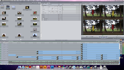
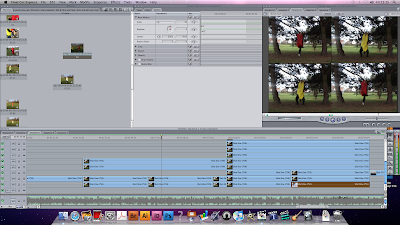
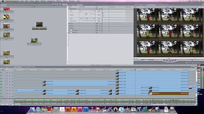
Music Video!!! (Final Cut)
Wednesday, 2 March 2011
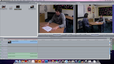
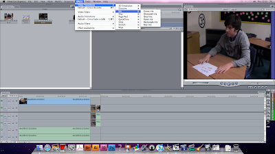
More Editing (Update)
Wednesday, 23 February 2011
Textual Analysis of previous student work
This music viedo produced by A2 students is very different to the previous student work i analysed and of our music video, which is why i have found this one the most interesting.
Their use of black and white is more effective because the video is set at night time which helped emphasise on the atmosphere that the students wanted to create. the night setting fits well with the song choice, because chase and status music is known to be very high tempo because its techno based music, therfore a lot of connontations of booze, nightlife and drugs is related in their videos which the student has played with. the settings have been well thought through also because they have kept it rural, similar to the style of music which chase and status produce, therefore they have made the effort to film in rural areas to make the video dangerous and not simple.
the camera work is very good, they use alot of variation of shots to help keep the video fast paced in parts and to play with certain moods of the character in the video, for example when the character is drunk the shots are hand held to make it seem beleievable, when hes angry the shots are straight cuts to help pick up the pace. This clearly shows that they have thought about alot of stuff to fit in the video to make it work with the song and make it realistic.
editing in this video is noted because they use alot of transitions such as black to white to connote the charcters state of minds change, which was very effective. they keep the character stable at the beginning whilst the cars and buses were sped up which was also very effective, its quite similar to Michel Gondrys work because he is a huge influence on others who produce videos such as A2 level students by using objects and props to symbolise beats to a song which these students have used similarly. They similarly at one point split the screen into four parts gradually to also connote seperate beats which i found quite clever. Lastly another good element of editing i liked was the green effect when the character in the video pushes the kid at the cash machine, this clearly connotes that he is drunk, however the students have used something different to show hes drunk instead of repeating the handheld camera scene. this shows they have used great amounts of variation. overall alot of editing has been done which has successfully helped make their video very good.
the lip syncing was very good too especially as the lyrics are said very fast therefore alot of time and effort would have been done to get it precise. i thoroughly enjoyed this video and was very interesting to watch a differnt genre to indie style music. i found it very influential and well thought through.
Textual Analysis of previous student work
This music video was created by students who were also filming for their A2 media coursework, it was great to watch other students who have used similar resources as us and have produced a well panned narrative based music video. the song "Mardy Bum"found on the album "Whatever People Say I Am, That's What I'm Not" a well known song by the Arctic Monkeys, which has probably a high influence on the students as the Arctic Monkeys are a very succesful band originated from sheffield.
i found the narrative fitted well with the song choice which fits well with the idea of comparing lyrics to narrative, a good analyse of one of goodwins 6. This helped the students make the music video make sense to their audience as alot of Arctic Monkeys songs have narrative and performance based videos such as "when the sun goes down" which is a brilliant example of one of the Arctic Mokeys best narrative music videos.
The students lip syncs are very precise to the music which always makes a A2 music video believeable because there is nothing worse when the music doesnt fit the performers lips movement. The imprevisors of the Arctic Monkeys in the students video are very good too because they share the same characteristics as do the Arctic Monkeys which shows they have clearly analysed the techniques to make their video fit the genre music the Arctic Monkeys produce.
they chose to keep their video basic by using black and white all the way through. This keeps the lighting minimalistic because i didnt find there was any diffence in the lighting by using it, however it was quite effective when the two boys are running down an alley way as the black and white helped make it look dindgy and dark, but i think they could of improved by using more lighting on the performace parts just to show emphasis on their significance to the video, similarly to other music videos that are produceded on the likes of MTV.
their camerawork was good especially when they used straight cuts of the performers playing the instruments, to fit with the beat i found that very effective. On the other hand i think they could of used more close up shots on parts such as the girl in the kitchen because she was obviously a lyric related part of the video, therefore as the audience we wanted a closer view, or they could of made it more effective by not seeing her face because it leads more to the imagination in my eye, because i did think it made the video too choreographed.
the setting was good especially in the alley way because the Arctic Monkeys are known to using very rural areas, this shows that their influence helped the students with their work. however where the students performed as a band i got the impression they were performing in a class room which spoilt the video because they kept it simple without going to any effort on finding somewhere out of their depths.
overall i found the video good because i know that it would have taken alot of practice by those who mined the lyrics and learning the instruments, therefore effort was visible in the video. There are though a few adjusments i would make just to help keep it realistic and believable. I have found this helpful because i have looked at our video from certain points at a different perspective to change parts that could help make it better, however i think the choice of song for our music video can get away with unrealism as our song choice is very enthusiastic whereas this particular song is very rustic.
Textual Analysis of "brainstorm" by Arctic Monkeys
This Muisc Video uses alot of elements for a successful music video for the audiences eye. The use of colours to make parts of the video to stand out is very similar to what our group wanted to create in our music video.
Mes en Scene: each member of the band looks the part of the genre music they're performing, Indie. This creates a good look to the music that they're playing to provide their target audience with an influential look, which is very modern in todays fashion. The women dancers are wearing very basic clothing which reveals alot within the movements they're doing in the dance routine which is a good use of goodwin 6, an eye for the female body, this is a big factor on most music videos, however what i found most interesting was that you dont see oftenly female bodies or even provogative dancing because its more seen in R'n'B music therfore by using it in a different genre it makes the video stand out to the other indie style music videos. The dancers represent the musics beats, because if you watch carefully you can see their movements respond to the musics rhytm which aids the movement of the music video by becoming fast paced. Another interesting part in this video is that the settings used are very strange and obscure which is very effective for the upbeat rhythm of the music, in my opinion i get this feel of an asylym as though wherever you go you cant escape the "brainstorm" that is being created by the bands music.
the Arctic Monkeys are a very popular band and the goodwin 6 element of high performance levels of the band playing, is very important. by the band performing in their video it provides a huge influence on the audience for those who look up to them and also the audience want that notion to see the performers play because it creates an atmosphere like a concert does.
camera work: there is a lot of close up shots especially on parts where the band is playing, this is effective so that the audience get some form of involvement in the music. at the beginning of the video there is a shot where parts of the picture is cut out into a hectagon shape, this creates an immediate edgy feel to the video straight away, indicating that the video is going to be an indie genre because all that the hectagon shape holds is the band waiting to perform.
editing: the edits used are very obvious, they use alot of straight cuts to keep the video fast paced, it also fits well with the music because its fast paced and every time a new beat is audible the cut changes to another. This helps makes the video flow, even though clips are chopped into sectors whilst being intwined with other clips. This appears strange however, it does work because it relates really well to the title of the song and for its conceptive factor. Another edit used in the video is the great use of animation, especially of the womans mouth, where you see the movement under neath the muscle and skin, this would have required alot of effort and work, which makes the video become one of them high technified succesful videos.
Lighting: the lighting changes drastically through out the video, similarly to the cuts. they use a great amount of colour when the women dancers are performing, this makes them stand out because they're significance is big in the video because 1) they are unusual for their style of music 2) they represent the beat and the colour change helps represent the beats importance to their movement and 3) the colour is a huge comparison to the light used when the band play which is a bright light. the white light connotes their power and significance in the video as they are the high performers the "stars" and therfore the white light is their stardom and success.
Saturday, 19 February 2011
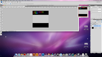
Evaluation
The final piece is somewhere between 5-6 minutes and goes into depth in answering questions about the production of our music video and ancillary tasks. It is formatted in the style of all the members of our group answering one of the questions, along with various clips from the music video and of the editing process, as well as pictures and screenshots layered over the top, much like a voice-over.
The evaluation also includes a backing track (Vampire Weekend's 'Giving Up The Gun'), which I think adds a slightly more atmospheric and professional quality, as well as sounding good and relating to the work we have already done.
After leaving ourselves with little time to produce the evaluation, I am pleased with what we have produced. I feel the style in which we have created the piece has worked very well, as it comes across as professional yet informal, while managing to avoid being dull and repetitive, which was an important objective.
Thursday, 17 February 2011
The Final Touches
We all felt that the filming went well and all the answers (written by Stan) worked equally as well. During filming, every member of the group took up the challenge of answering a question on camera, and all were successful.
The editing of the evaluation and the music video have been the main focus over the last few days, as opposed to the digipak and website development. We really want to perfect the moving image side of our portfolio.
Now that we are coming to the final stages of the project, we are starting to look at our production from an audience's point of view and we feel it is very entertaining.
We are very excited about the final product.
Website
http://www.wix.com/stanevans93/vampire-weekend
I feel I have managed to create a website that directly promotes our own project without straying beyond the boudaries of a professional and authentic band website. I think the key to this was finding a balance between linking the website directly to our own work, while maintaining a realistic and believable feel within the website.
The website contains a mix between official band pictures (such as promotional photo shoot pictures and live performances) and some of our own work (digipak covers that we produced on Photoshop and screenshots from our music video).
While trying to stick to various conventions used in the official Vampire Weekend website, I tried to give the website it's own identity, in the sense that I moved away from the official fonts, and employed a plain black background (which is an effect that we have also used with out digipak).
I found Wix an extremely useful programme, and it made the whole process a lot easier than I had anticipated, and I feel that it has enabled me to produce a website that we are all very pleased with.
Wednesday, 16 February 2011
Audience Feedback (Editing)


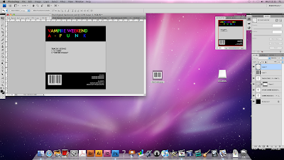
Digipak (Back)
 After a long day on Photoshop (PS) I have created the back cover that I wanted for the Digipak. Using the original copy of the Vampire Weekend CD back to inspire me I have created a similar and more, what I think is simplistic version.
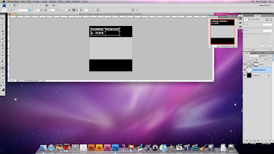

Evaluation
Monday, 14 February 2011
Digipak (Template)

Thursday, 10 February 2011
Website
Despite a few minor technical adjustments here and there I feel that the website is pretty much done. The website comprises of six pages:
HOME:
The page features a large picture of the cover of the new single (the one we designed for our digipak) accompanied by a release date for the single. This closely follows the style of the official Vampire Weekend website, which features a simple homepage with a large advertisement for the latest album 'Contra'.
MUSIC:
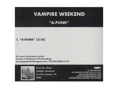
Features an mp3 of the song 'A-Punk' along with advertisements on where to buy various singles and both albums.
PHOTOS:
The page includes various pictures of the actual band, during live performances and from photo shoots, but also includes screen shots from our music video.
TOUR:
A list of various dates for ucoming live shows in the US, and details of how to access tickets.
CONTACT:
This includes a box in which you can email the band (although you can't actually email the band directly from our website) as well as details about following the band on twitter.
MERCHANDISE:
Advertising for band merchandise (this will of course be unofficial merchandise and you will not actually be able to purchase these items).
The only changes that need to be made are to do with tweaking design features (such as changing the font and updating the picture on the homepage).
These changes will be made as soon as possible and I will then be able to publish the website online.
Overall I am very pleased with the outcome of the website, and wix, despite throwing up some technical difficulties, has made this task a lot smoother than I had anticipated.
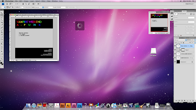
Digipak (Front)

Above is the finished copy of out front cover. I used photoshop to produce this image, with the hard task of layering the images. (Ending up with 180!) With the expertise of Miss Hill, I managed to cut away certain lines of the letters as you can see from the images. I really like this idea and I feel that the end result was exactly what I was aiming to produce.
With the image of the fruit in the middle of the shot I think this gives a unique sense to the cover as it is quite random, and yet still relates to our project.
I will follow with another post in the next few days. Using the website: http://www.discwizards.com/cd-dvd-artwork-templates.htm I will work on a template that I have chosen and will decide how to structure our digipak and design it.
Ian
Wednesday, 9 February 2011
Effective Editing
- Produce sleek and professional looking production
- Use quality footage and editing techniques effectively
- End up with a music video that entertains and impresses the audience
Now that we are currently in the editing process it would be appropriate to employ some effective editing in order to achieve our aims.
As you can see from previous posts, we have planned for a long time to draw in editing techniques used by professional music video directors into our own production. We are now starting to see some of this planning come to fruition. We are currently employing one of Michel Gondry's techniques as a main part of the video. This technique was used by Gondry during his video of the White Stripes - 'Hardest Button to Button'. It involves the tedius process of cutting multiple parts of the clip out in order to create the effect of unatural movement on the beat (it is hard to explain).
We hope to continue to use this effective editing in order to have a positive effective on the audience. We want to be different, but impressive.
Oli
Textual Analysis
'Hang You from the Heavens' is the debut single by American alternative rock band The Dead Weather, released in March 2009. The single was accompanied with a low budget music video.
The video is shot entirely in black and white and uses only two camera angles and features the band members sitting inside of a photo booth in various sequences and combinations. Despite it's simplicity, the video successfully uses the technique of quick cutting in time with the music, which not only provides an effective link between the music and visuals, but also creates an awkward, unnatural atmosphere that matches the style of music. This is a technique that we have made significant use of in our music video, to again add a kind of quirky feel to the video.
Jack White, of The White Stripes and The Raconteurs, is one of the founders of the band and also produced the record, and parallells can be drawn between this video and the video for The White Stripes' 'The Hardest Button to Button', directed by Michel Gondry. The video uses the cutting on the beat technique, while Jack and Meg White and their instruments move through various urban locations.
Saturday, 5 February 2011
Division Of Labour (Post Filming)
Friday, 4 February 2011
Analysis Of Previous Student Work
We must bear in mind that he is at degree level and we can therefore assume that he will have better equipment and more spare time to have made his production but nevertheless we can still compare to his video.
This is a very nice, fluent video which really matches the song. I think that considering his situation he has produced a brilliant film. He is by himself and has managed to film all of his shots by himself in public areas. As you can see from the comments on his video, he spent 4 days filming this production and 3 days editing. We can relate to this as we are in a similar situation at the moment. Also with all the cutting on the beat which we are creating, he did a similar idea throughout his entire film.
Having watched this video before filming, I am glad that I could branch some ideas from his production and hope that our project will be as successful as his is in terms of the fluency and precise editing.
Ian
Textual Analysis
I have found the following video which is a real inspiration for me personally, I feel that the use of reverse shooting in the film really emphasises the narrative and although we are not looking for the exact same affect I believe it still gives the video a unique appeal.
http://www.youtube.com/watch?v=bxNJHuM0Js0
You can see the effect the reverse editing has on the video and how inflectional it is. Although we are using it for a different purpose I hope you can now understand how we will incorporate this effect to our production.
Ian
The Editing Process
I predict we will have finished our editing by next Friday (11th) and will then have one week drawing up our evaluation together using feedback from audiences and our entire production should be finished and burnt onto a disk by Friday the 18th of February.
As this is the first time I have used Final Cut it has been very challenging for me, learning everything from scratch and using only mine and my teachers' knowledge. We have come across many problems which we have struggled to cope with throughout editing, such as manipulating clips in new ways, reversing shots, speed shots up, rotating the frames and also how to display audio waves. I had to use external resources to figure out problems such as YouTube videos and Online Forums.
I have learnt a lot throughout this last week. I now feel a lot more comfortable on Final Cut Express, I will continue to edit the last parts of our production together next week until I am happy that it is up to standard.
Ian
Textual Analysis
Thursday, 3 February 2011

This image was our favourite. we decided to go with this image because of its unigue look and aspect of a typical fruit bowl. The fruitbowl looks ancient and old fashioned which was something we were all interested in creating into something a bit tasty. even though the clours looked abit washed out, we were able to change and alter the colours by using photoshop. It did take us nearly a lesson to figure out how to apply all the colour changes, contrasts and transformations, but we successfully found what we were looking for by creating a gold effect on the original image. we were definately happy with the results and will update when the final piece is done.

digipak progress
we have used the image of a fruit bowl which we downloaded onto the mac to use in the software photoshop. We made the background black and cut around the fruit bowl and placed the cropped picture over our black background. We then played around with the colour of the fruit bowl to make it a bit wacky and fun, we changed the colour and contrast to make the fruit bowl gold. The gold effect has created a feel to the digipak because it makes the fruit bowl appear ancient but fresh at the same time. we wanted to make the cover look unique and different as we didnt want the average looking fruits in a bowl,otherwise the digipak and music video would clash.
lastly we designed a similar text to the "Vampire Weekend" style to keep some of its originallity.
Me and Oli definately had some fun creating our first draft of the digipak, however it did come along with some difficulties. We were fustrated with alot of the tools involved with photoshop, but we learnt by asking advice and exploring the software ourselves we would achieve the best for our digipak.
Wednesday, 2 February 2011
Filming
The majority of the filming was done in Nowton Park in Bury st Edmunds, as it provided us with lots of space to put all of our ideas into fruition (no pun intended), as well as being a place with few distractions and interferences.
The setting worked very well, as we were able to use our surroundings to suit us (such as the 'corridor of trees' setting, which we used to frame one of our scenes).
All the footage has been uploaded today where we will decide of we need to re-film any shots, or if there are any other shots that will work in the video. However, overall I think that we have basically all the footage we need to make it into a great music video.
Friday, 28 January 2011
The Digipak Design Process
Our original designs (displayed in the previous digipak update) depict a fruit bowl on the front. We plan to use an SLR camera to capture a fruit bowl image. We can then upload this image to Photoshop. Using the SLR camera will give us a high quality image which will allow us to expand it or shrink it without distortion.
We have already been experimenting with Photoshop and have created a great platform for the fruit bowl image to be layed on. This platform consists of a black background, the song title and band name in the official 'Vampire Weekend' font, and also a splattering effect that we are experimenting with as well.
We seem to be developing our digipak well despite Photoshop being a very complicated program to use. I will keep you updated on any digipak developments.
Oli
Thursday, 27 January 2011
Saturday 29th of January - The Big Day!
After our thorough practice shoot we managed to get some great shots and experiment with some very interesting camera angles. All of which will be taken into consideration come Saturday. We really feel that the practice shoot was invaluable to our production, as the practical experience in the field stimulated more planning and creative thought.
We are especially pleased with our costumes, that arrived in the nick of time. They are much better than we expected, creating a comic atmosphere, which in turn is reflected within the shots we recorded. We are also pleased with some discoveries we made during the practise shoot. These discoveries included using the sunlight to create a natural haze to our shots. We hope to imitate this on Saturday by filming at a similar time (1-3pm) when the sun is at the perfect position. Obviously, we cannot completely rely on the weather to come through for us and therefore we do have a back up plan. If the sun doesn't appear during our shoot then we will replicate the haze during editing.
On Saturday, we plan to shoot in Nowton Park, in the large open areas. As you will be able to see in my previous location post, Nowton Park provides an unbeatable compromise between convenience, features and the fact that it will be an unrecognisable location (promoting a professional look). We have also roped in an experienced actor (when it comes to media productions) in the form of Luke Pilkington-Amps, who has played the protagonist in no less than three productions. He will be joining Stan and myself (as we have also acted in media productions before) as the main characters. Stan and I will take responsibility for as much camerawork as possible (when we are not in front of the camera), as we will spending the majority of the time acting.
We have planned this shoot well and hope it will be a great success, providing us with some great shots and room to play with during post production. I will post on how the shoot goes after Saturday. I'm sure it will be successful.
Oli
Filming schedule
It was the first time we had been able to film with all of the costumes, and it turned out to be very successful. It was exciting for us to see that the costumes provide the sense of energy and fun we were looking for, matching the songs upbeat and fast-paced style.
We were able to film a variety of shots that we felt matched the atmosphere of the song, following the style of Goodwin's idea of 'a relationship between music and visuals' as a music video technique.
Along with filming some footage, this also gave us an opportunity to see what would and woudn't work in future shooting. We discovered some new shots that we feel would work perfectly in the video, and others that either weren't right for the video, or that we wouldn't be able to shoot for other reasons (such as lack of funds).
Overall, this session was certainly successful. We hope to complete the filming process at our next scheduled session on Saturday 29th January.
Wednesday, 26 January 2011
Division Of Labour (Pre Production)
Monday, 24 January 2011
Photoshop and Digipak update

We liked the idea of a simple cover, with the band name and song title in plain font, with a fruit bowl in the middle of the cover. This links in with the main concept of our music video as well as providing an original, attractive cover.
We also decided on what features the Digipak should contain. Seeing as we're not the band that recorded the song there are a couple of restrictions, but we will include song lyrics and pictures related to the filming and production of the video, while maintaing the design features on the front cover.
Saturday, 22 January 2011
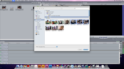
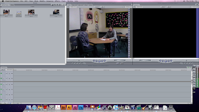
Final Cut
As we have never used this software before we have had to learn from everything from scratch. Last week we had practises with Final Cut to get use to it, we uploaded some previous student work from an old tape so that we could play around with the clips.
I have added screenshot showing sow of the basic skills we have covered in our lessons which we will need when using final cut.

This screenshot is just us uploading the footage we want into Final Cut, we found the best way to achieve this was to import files to iMovie, the same way as we did last year, and then import from iMovie across to Final Cut.
Wednesday, 12 January 2011
Directors Study
Gondry's 'The Green Hornet', a high-octane comedy starring Seth Rogen, is set to be a box office hit and has an estimated budget of $90 million. The fact that he has been trusted with such an important and financially daunting project highlights just how successful he has been over the years, and is a true inspiration to our group.
This is the IMDb profile for the film:
http://www.imdb.com/title/tt0990407/
Mark Romanek's 'Never Let Me Go', which has already proved to be a huge success after being released in the US, is set for the same reception over here. The film has already been nominated for many awards and has been tipped by many for success at the Oscars.
This is the IMDb profile for the film:
http://www.imdb.com/title/tt1334260/
While this doesn't have any direct relevance to our music videos, both of these directors have been hugely influential in the production of our video, and it is interesting to follow their exploits in whichever form of media it is.
Monday, 10 January 2011
Analysis of previous student work
Viewing pervious student work cannot only inspire us with ideas to use in our own production, but also set us a standard to which we want our work to reach. Here is a video from 2006 and this is the music video that my Brother produced when he was in my very same position 5 years ago. After downloading the Hand-break application onto my Mac I have managed to burn this video from a DVD and have now uploaded it to YouTube.
This video is in many ways similar to what we hope to achieve. It also is a very fast paced song with lots of drum beats and guitar riffs. This video works to the song in the way that it is cleverly edited to the effect that the music creates. The bar location which is seen in this video was completely structured for the sake of the music video alone, with amazing attention to detail this video really shows use how much we can achieve in our production.
In particular I enjoy this video because of the precise and fine editing, for example the fast and slow effects that are used to great effect and the reference to the link between the audio and the visuals, for example when we see him (Tom) falling over in the streets to the lyrics, "I'm heading to crashland" at 1:51.
Some of the camera shots that are in this video are very creative, in the opening scene we have Tom in bed when gets up and leaves the room there is a clever transition of the shot were he walks into the camera and is then followed from behind. I think this is a very effective shot and unique which works well and I think we can use something similar to this in our production. Another shot I personally like is at 2:52 were the bottle is slid into the camera shot and creates a powerful straight cut which is timed excellently with the audio.
When filming and editing we will bear in mind to refer back to previous student work to adapt ideas from past successes.
Ian
Friday, 7 January 2011
Latest Update
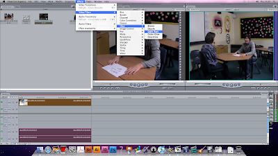
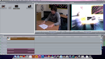
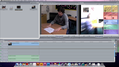
We will be using like every other group "final cut" which is a software on the Macs where we can edit filming to create a brilliant piece of media work. we have looked at past students work that have also used this software and have created some outstanding work, therfore we can be inspired by the work done by "final cut" into our music video.
recently we have looked at transitions and the different effects that we can use to create this fun, enthusiastic, edgy music video that we hope to share with other media students. we have played around with the transitions and effects with old clips so that we know clearly what to use with our clips when we come to edit. there is a lot to choose from which gives us an advantage to have fun with editing our video.
Textual Analysis Jay-Z 99 "problems"

We studied this music video in class when reviewing a range of Mark Romanek’s past work, and we came across some good use of camerawork and lighting which we would like to involve similarly in our “A punk” video.
Mes en scene:
The lyrics of the song portray a very specific genre of music, rap. Obviously the style of song is very different to our choice of music, however the use of space with his settings interested us to influence this in our music video. Romanek has taken great care of referring jay-z’s lyrics to the setting therefore sets the narrative of this music piece in New York City, which the lyrics refer to, a stereotypical gangster lifestyle. To address their status in jay-z’s well known hit “99 problems”, Romanek makes good use of props by this idea of gun use and money which is what we connote with a gangster. You can also get an idea of this lifestyle by the policeman who stops jay-z in his “pimped out” car with money in his boot which shows the audience the idea of drug dealing which also is connoted by gangsters. Jay-z is also portrayed as this gangster who is known globally as successful through his talent and has out beat his past life which we see when his name and face is on a televised pin bored in central park. From this video we have been inspired by the use of great detail of setting use as it does make that bigger difference when you can clearly see that time and effort has been done to get the best shots, therefore Romanek’s work has been inspiring, even though it’s a different genre song.
Editing and Lighting:
through out the music video Romanek has kept it black and white which is very effective especially in this style of music, because it can be used to refer to the idea of comparison of black and white culture which it is in some ways in this video. It also can be done to make the video edgy and also to make parts stand out, such as shadows. This helps with the choice of lighting too as Romanek has used a mixture of low key lighting high key lighting to create a particular appearance to the audience’s interest. Low key lighting is visible in parts of the video when danger is suggested for example; when the police stop jay-z in the car in a mysterious setting of blocks (flats) and metal staircases with “garbage bins” a stereotypical New York City setting. The low key lighting helps connote danger and crime.
Camerawork:
Romanek uses a lot of tilt shots so that the camera appears to be low and looking up at the big idle Jay-z himself, this gives jay-z as an artist power and status towards the audience. Tilt shots are very effective therefore could be fun to play around with in our media piece. Romanek also uses a great amount of close ups which is for obvious reasons by giving the audience clear shots of the star “Jay-z” this relates to one of Goodwin’s 6 of the record labels honor of the artist.